9  Quick tips

9.1 Model specification

Just in case you need a refresher, here are some useful reminder on the operator used to specify a model in the formula argument:

  • ~ is the most basic operator in a formula, and means “in function of”. On the left side of this operator, you will find the response variable, on the right side, the linear combination of independent variables. y~x+z can be read as “y in function of x and z”.

  • + allows you to add variables to your model

  • : is used to incorporate an interaction term. y~a+b+a:b fits the model “y in function of a, b, and their interaction”.

  • * provides a convenient shortcut to include variables and their interaction. y~a*b is the same as y~a+b+a:b.

  • - can be used to remove terms from a model. A special case is -1, indicating that we want to consider a model without an intercept term. This can be useful when one of the independent variables is categorical.

  • I() is actually a function, and is used to indicate that the elements within it needs to be interpreted as their mathematical meaning, and not their formula equivalent. y~a+b+I(a^2) for example is used to consider a quadratic term on a.

9.2 Using an offset in a Poisson or Negative Binomial regression model

In some situation, we are interested in modeling rates rather than directly counts. Let’s consider a situation where a researcher counted birds along multiple routes, with each route being a separate sampling unit, but with different lengths. In this case, it would not make sense to directly model the counts: if 2 routes have the same counts, but one is 10 times as long as the other, directly modeling the counts would not be meaningful. Here, we are intrinsically interested in the number of bird per km (or mile) of road. Because glm() only takes counts as outcome for Poisson and Negative Binomial regressions, we need to set up an offset in our model.

Allow me to math our way through this really quick. Remember how for Poisson and Negative Binomial distributions, we assume that our response variable is expressed as a linear combination of explanatory variables on the log-scale?

\[ log(Y) = \beta_0 + \sum_i {\beta_i X_i} \]

Now, if we express our response variable \(Y\) as a rate of actual discrete counts over some baseline \(n\): \(Y=\frac{counts}{n}\) , we can reformulate our equation as:

\[ log(\frac{counts}{n}) = \beta_0 + \sum_i {\beta_i X_i} \]

With a little bit of moving things around….

\[ log(counts)-log(n) = \beta_0 + \sum_i {\beta_i X_i} \]

\[ log(counts) = log(n) + \beta_0 + \sum_i {\beta_i X_i} \]

We’re back to a formulation where we have a discrete response variable (counts) expressed as a linear combination of covariates. \(n\) is just another variable, it is just log-transformed and with a slope set to 1! We’re back in a situation that can be modeled by glm() .

In practice, this is done by either specifying it in the formula using “offset()” or using the “offset” argument of the “glm()” function. Again, note that, because of the log-link function, we need to make sure to use a log-transformed offset!

## Simulation parameters 
n.samples = 20

intercept <- 5
slope <- 3
independent.var <- rnorm(n.samples)

exposure <- round(runif(n.samples, 1, 10),2) 

## Simulating data
log.lambda <- intercept + slope * independent.var    # linear expression of the underlying ecological process on the log-scale
lambda.preexposure <- exp(log.lambda)  # resulting mean abundance per unit of exposure
lambda <- lambda.preexposure * exposure  # 'encountered' mean abundance based on exposure
counts <- rpois(n.samples, lambda = lambda)   # realized counts
data=data.frame(Y=counts, n=exposure, X=independent.var)

## Including offset(log(n)) in the right hand side 
model.1 <- glm(Y ~ X + offset(log(n)),
               family = poisson, data = data) 
summary(model.1) 

Call:
glm(formula = Y ~ X + offset(log(n)), family = poisson, data = data)

Coefficients:
            Estimate Std. Error z value Pr(>|z|)    
(Intercept) 5.006799   0.007318   684.2   <2e-16 ***
X           2.994029   0.005420   552.4   <2e-16 ***
---
Signif. codes:  0 '***' 0.001 '**' 0.01 '*' 0.05 '.' 0.1 ' ' 1

(Dispersion parameter for poisson family taken to be 1)

    Null deviance: 494710.66  on 19  degrees of freedom
Residual deviance:     20.41  on 18  degrees of freedom
AIC: 189.87

Number of Fisher Scoring iterations: 3
## Using the offset option 
model.2 <- glm(Y ~ X, 
               offset = log(n), 
               family = poisson, data = data) 
summary(model.2) 

Call:
glm(formula = Y ~ X, family = poisson, data = data, offset = log(n))

Coefficients:
            Estimate Std. Error z value Pr(>|z|)    
(Intercept) 5.006799   0.007318   684.2   <2e-16 ***
X           2.994029   0.005420   552.4   <2e-16 ***
---
Signif. codes:  0 '***' 0.001 '**' 0.01 '*' 0.05 '.' 0.1 ' ' 1

(Dispersion parameter for poisson family taken to be 1)

    Null deviance: 494710.66  on 19  degrees of freedom
Residual deviance:     20.41  on 18  degrees of freedom
AIC: 189.87

Number of Fisher Scoring iterations: 3

9.3 Centering and scaling independent variables

When independent variables vary a lot in terms of range and distribution, we can be faced with fitting and identifiability issues. This is why it can be helpful to pre-process the data by scaling and centering them. Fortunately, base R has an easy and convenient scale() function just for that. It takes a vector or matrix of numerical data and returns centered and/or scale values (by columns for matrices). We can also extract information about how it was centered (by default by the mean) and scaled (by default by the standard deviation) by looking at the attributes of the scaled object.

x <- runif(10,5,100)
scaled_x <- scale(x)
attr(scaled_x,"scaled:center")
[1] 41.04223
attr(scaled_x,"scaled:scale")
[1] 26.85356

We can also specify the values to be used for centering and scaling. This is especially useful when creating new data frames for predictions, where we will want to scale the new data in a similar manner as what was done in the original dataset.

x.new <- runif(10,5,100)
scale(scaled_x,
      center = attr(scaled_x,"scaled:center"), 
      scale=attr(scaled_x,"scaled:scale"))
           [,1]
 [1,] -1.573810
 [2,] -1.456673
 [3,] -1.549480
 [4,] -1.508986
 [5,] -1.501877
 [6,] -1.567087
 [7,] -1.555794
 [8,] -1.531373
 [9,] -1.493549
[10,] -1.545090
attr(,"scaled:center")
[1] 41.04223
attr(,"scaled:scale")
[1] 26.85356

We can backtransform our scaled data fairly easily by multiplying the scaled values by the standard deviation and adding the mean of the original data (again, available as attributes of the scaled data).

m = attr(scaled_x,"scaled:center") 
sd = attr(scaled_x,"scaled:scale")

unscaled_x <- (scaled_x * sd) + m

There are currently no “unscaling” function in base R, but we can easily create one ourselves to streamline backtransformation for graphing purposes for example:

unscale=function(scaled_x,center=NULL,scale=NULL){
  if(is.null(center)) {
    m = attr(scaled_x,"scaled:center")
  } else {
    m = center
  }

  if(is.null(scale)) {
    sd = attr(scaled_x,"scaled:scale")
  } else {
    sd = scale
  }  
  
  unscaled_x <- (scaled_x * sd) + m
  return(unscaled_x)
}

x = runif(10,1,10)
scaled_x = scale(x)
unscale(scaled_x)
          [,1]
 [1,] 4.662714
 [2,] 1.077006
 [3,] 1.609009
 [4,] 5.848328
 [5,] 2.136137
 [6,] 9.844241
 [7,] 1.604968
 [8,] 8.951453
 [9,] 2.916171
[10,] 9.372755
attr(,"scaled:center")
[1] 4.802278
attr(,"scaled:scale")
[1] 3.489717

9.4 Creating new data for prediction

Creating new datasets for prediction can be tedious, especially if we want to be able to include all possible combinations of our variables. The expand.grid() function is an invaluable tool for this task:

sex = c("Male","Female")
age = seq(1, 5, 2)
length = seq(0, 12, 4)


expand.grid(sex=sex, age=age, length=length)
      sex age length
1    Male   1      0
2  Female   1      0
3    Male   3      0
4  Female   3      0
5    Male   5      0
6  Female   5      0
7    Male   1      4
8  Female   1      4
9    Male   3      4
10 Female   3      4
11   Male   5      4
12 Female   5      4
13   Male   1      8
14 Female   1      8
15   Male   3      8
16 Female   3      8
17   Male   5      8
18 Female   5      8
19   Male   1     12
20 Female   1     12
21   Male   3     12
22 Female   3     12
23   Male   5     12
24 Female   5     12

9.5 Using ggplot2 for predictions

We have already seen how to compute and plot GLM predictions using ggplot2:

library(ggplot2)

fish.data=data.frame(sitenumber=1:100,
                     fish.population=c(7, 3, 7, 1, 9, 1, 0, 0, 33, 15, 0, 8, 10, 6, 6, 0, 5, 4, 0, 0, 18, 1, 0, 4, 9, 35, 7, 6, 52, 18, 2, 6, 0, 1, 1, 1, 17, 0, 1, 0, 1, 2, 3, 2, 1, 5, 21, 5, 3, 2, 0, 2, 12, 4, 0, 0, 3, 0, 0, 2, 4, 10, 13, 10, 2, 4, 15, 3, 4, 20, 2, 1, 33, 0, 3, 0, 6, 32, 15, 0, 18, 5, 1, 1, 1, 0, 0, 52, 2, 23, 0, 4, 8, 4, 6, 13, 4, 0, 0, 3) ,
                     # Standardized food availability: 
                     food=c(0.7726, 0.3052, 0.4091, -0.7749, 0.9618, -0.2377, -1.2015, -0.8639, 1.6418, 1.1006, -1.2936, 0.3786, 0.5588, 0.3441, 0.4137, -0.625, 0.5609, -0.2873, -0.7354, -2.353, 1.3576, 0.0096, -1.6573, 0.5267, 0.9805, 1.5259, 0.4241, 0.5559, 1.9227, 1.1616, -0.4877, 0.434, -1.3075, -1.2571, -0.4045, 0.3146, 1.0496, -1.1584, -0.9643, -0.7425, -0.6268, -0.2768, -0.0564, 0.0732, -0.4332, 0.7553, 1.2763, 0.5868, 0.0771, -0.2776, -0.1421, -0.5285, 0.8199, 0.11, -0.4764, -1.189, 0.3835, 0.1221, -0.327, -0.4722, 0.4809, 0.9963, 0.8434, 0.9199, -0.2348, 0.308, 1.0344, 0.0919, -0.0676, 1.317, -0.2041, -0.4657, 1.565, -0.8463, 0.457, -1.1507, 1.0512, 1.7268, 1.0127, -0.4697, 1.4311, 0.1237, -0.8073, -0.6794, -0.8374, -0.053, -1.2292, 1.8966, -0.3192, 1.4033, -0.6946, 0.1261, 1.1178, -0.0309, 0.9486, 0.9798, -0.4686, -1.9257, -1.4116, -0.1264) )
                     
fish.res=glm(fish.population~food, family=poisson, data=fish.data)

food.new <- seq(min(fish.data$food), max(fish.data$food), length.out = 100) # Creating new values of the covariates for which we want to predict the response variable 
resp.pred=data.frame(food=food.new)

resp.pred$pred <- predict(fish.res, newdata=resp.pred, type="response") # Predictions


pred.linkscale <- predict(fish.res, newdata=resp.pred, se=T)
pred.linkscale.CI2.5  = pred.linkscale$fit-1.96*pred.linkscale$se.fit
pred.linkscale.CI97.5 = pred.linkscale$fit+1.96*pred.linkscale$se.fit

resp.pred$CI2.5  = family(fish.res)$linkinv(pred.linkscale.CI2.5)
resp.pred$CI97.5 = family(fish.res)$linkinv(pred.linkscale.CI97.5)


ggplot() +
  geom_point(aes(x=food,y=fish.population), data=fish.data) +
  geom_line(aes(x= food,y=pred ),col="red",data=resp.pred) + # Fitted values
  geom_ribbon(aes(x=food, ymin = CI2.5,ymax = CI97.5),
              alpha=0.15,data=resp.pred) +
  labs( title="Fish abundance depending on food resources",
        subtitle = "Basic approach",
        x="Food",
        y=" Abundance") +
  theme_minimal() 
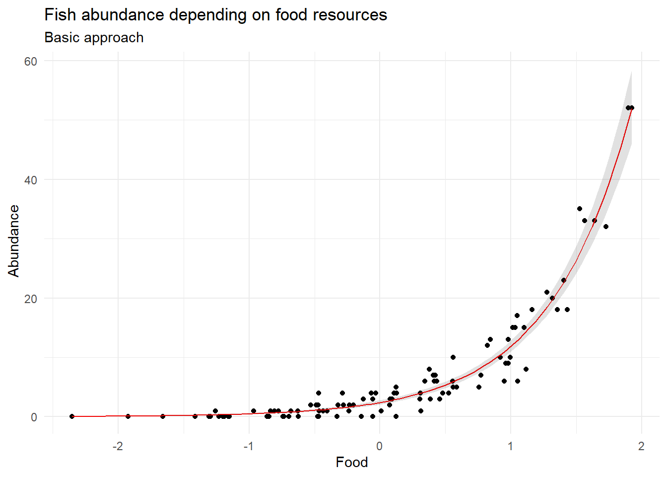
Figure 9.1: Prediction visualization using the basic approach

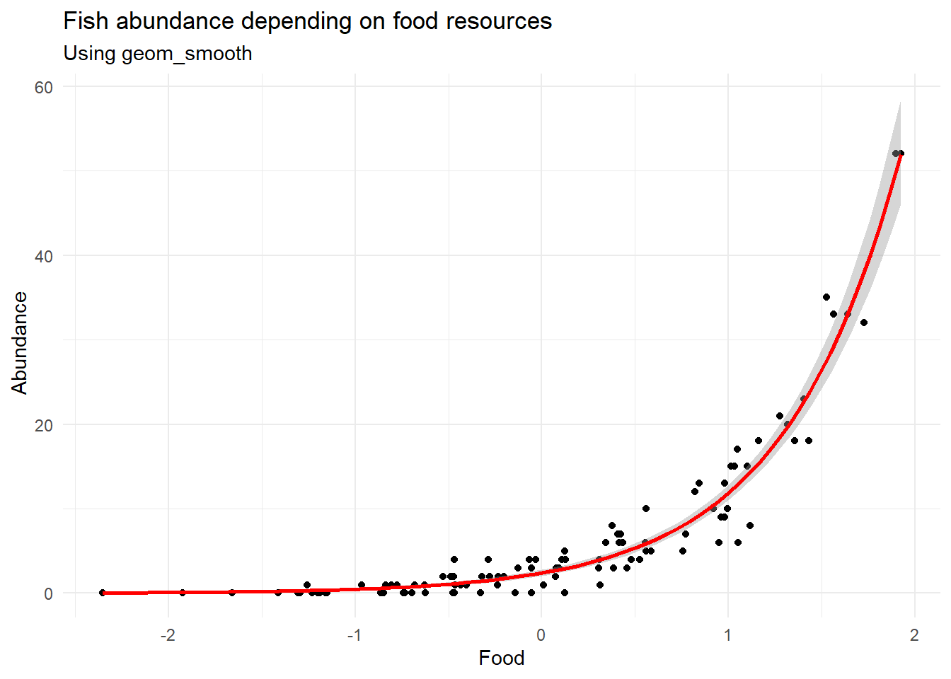
But did you know that ggplot2 also has a convenient geom_smooth() that can do a lot of the work for us if we are just interested in plotting?

ggplot(fish.data, aes(x = food, y = fish.population)) +
  geom_point() +
  geom_smooth(method = "glm",
              formula = y ~ x,  # could be omitted here
              method.args = list(family = poisson), 
              se = TRUE, color = "red")+
  labs( title="Fish abundance depending on food resources",
        x="Food",
        y=" Abundance",
        subtitle = "Using geom_smooth") +
  theme_minimal()
Figure 9.2: Prediction visualization using geom_smooth

9.6 About confidence intervals

Confidence intervals (CI) estimate the range for a population parameter (e.g., the mean).

So far, we’ve used a simple approach to compute CIs. We’ve taken the standard deviation, multiplied by ±1.96 (the z-scores corresponding to the 2.5% and 97.5% percentiles for a standard normal distribution), and substracted/added it to the predicted values to get our 95% Confidence Interval. This approach is called the Delta method, and the resulting interval is a parametric interval (as it relies on the use of parameters). It relies on the assumption that our residuals follow a normal distribution. It is convenient and fairly easy to calculate. It also only produces symmetrical intervals (on the linear predictor scale).

Another approach to computing CIs relies on bootstrapping methods. It relies on resampling (with replacement) the original dataset a certain amount of times, restimating the parameters of interest each time. From there, we can define a bootstrap sampling distribution for our parameters. Finally, we can figure out the bootstrap 95% confidence intervals by identifying the 2.5% and 97.5% quantiles of the bootstrap distribution. This approach is non-parametric and can work with more “exotic” data.

Confidence intervals should not be confused with prediction intervals. CI estimate the range that is expected, with a certain level of confidence, to contain the true value of a population parameter. Prediction intervals (PI) on the other hand predict the range for a future, individual observation. In other words, PIs estimate the range that is expected to contain the true value of a random individual data point, based on a prediction made using regression analysis. While CIs are narrower and focus on the mean, PIs are wider, accounting for both parameter uncertainty and individual variability.

We can compute all 3 types of intervals using the ciTools package.

library(ciTools)
library(dplyr)

The add_ci function can compute both paramteric and bootstraped confidence intervals, just by changing the value of the type argument. It needs the data over which we want to predict our CIs, as well as the statistical model we want to use to generate them. It is going to add columns containing the predicted means, as well as lower and upper confidence interval boundaries to the input dataset. First, let’s do the parametric CI:

df.delta <- add_ci(fish.data, fish.res, type = "parametric", 
                   names = c("lwr", "upr")) |>   # Specifying the names we want to use for our lower and upper bounds
             mutate(type = "Parametric CI")  # Will be used for plotting purposes below

Then, for our bootstrapped CIs. This time, we also have to specify the number of bootstrap simulations used to compute the CIs.

df.boot <- add_ci(fish.data, fish.res, type = "boot", names = c("lwr", "upr"), nSims = 500) |>
             mutate(type = "Bootstrap CI")

Finally, let’s use the add_pi to compute the prediction intervals, using the same syntax as for add_ci.

df.pi <- add_pi(fish.data, fish.res, names = c("lwr", "upr")) |>
             mutate(type = "Prediction interval")

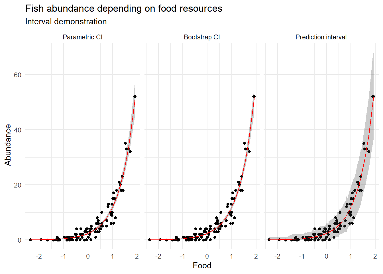
We can plot all three interval types side by side, to compare them.

df.intervals <- bind_rows(df.delta, df.boot, df.pi)


ggplot(df.intervals, aes(x = food, y = fish.population)) +
    geom_jitter(height = 0.01) +
    geom_ribbon(aes(ymin = lwr, ymax = upr), alpha = 0.25) +
    geom_line(aes(x =food , y = pred), size = 0.5 ,col="red") +
    facet_grid(~ factor(type, levels = c("Parametric CI", "Bootstrap CI", "Prediction interval") ) )+ 
    labs( title="Fish abundance depending on food resources",
        x="Food",
        y=" Abundance",
        subtitle = "Interval demonstration") +  
    theme_minimal()

In this case, parametric and bootstrapped CIs are really close, and (as expected) the prediction interval is much wider.